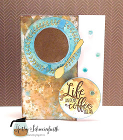
Yep...I agree with this sentiment for sure! When those little things happen in life (like I run out of an ingredient while trying to make a particular dish), a cup of java eases the frustration, puts things in perspective...and I just call for take out!
For my card, I played around with Distress Oxide Ink pads to create the backdrop and color in the elements. The plate/cup/spoon are from one of my favorite coffee sets from Concord & 9th: Let's Chat. The sentiment is from another fave from Verve Stamps: Coffee Helps.


Hi Kathy! There are so many cards in this season's hop that I've only been able to click on my favorites and so many are yours! Another really fun design with great craftsmanship!
ReplyDeleteTake Care!
Michele
You're rockin' the hop Kathy! this is a beauty!
ReplyDeleteOh this is beautiful, Kathy!
ReplyDeleteSuch a lovely card!! Beautifully done!
ReplyDeleteI'm a big fan of Distress Oxides and this is beautiful Kathy.
ReplyDeleteAnother FABULOUS card, Kathy! You're so creative.
ReplyDeleteBlessings,
Karen L
www.karen-mycuprunnethover.blogspot.com
Kathy, Love the colors you chose and the background you created. Sylvia D.
ReplyDeleteFabulous!
ReplyDeleteHow cool is this! Your background rocks and I love the top down coffee cup look! So cool! Hugs, Autumn
ReplyDeleteBeautiful colouring!!!
ReplyDeleteLove, love, love this color combo - beautiful!
ReplyDeleteBeautiful coffee design and wonderful colors.
ReplyDeleteGorgeous card and I love the colors!
ReplyDeleteso nice!
ReplyDeleteLove the colors and they make a great card.
ReplyDeleteThat background is amazing! Such a sensational card.
ReplyDelete